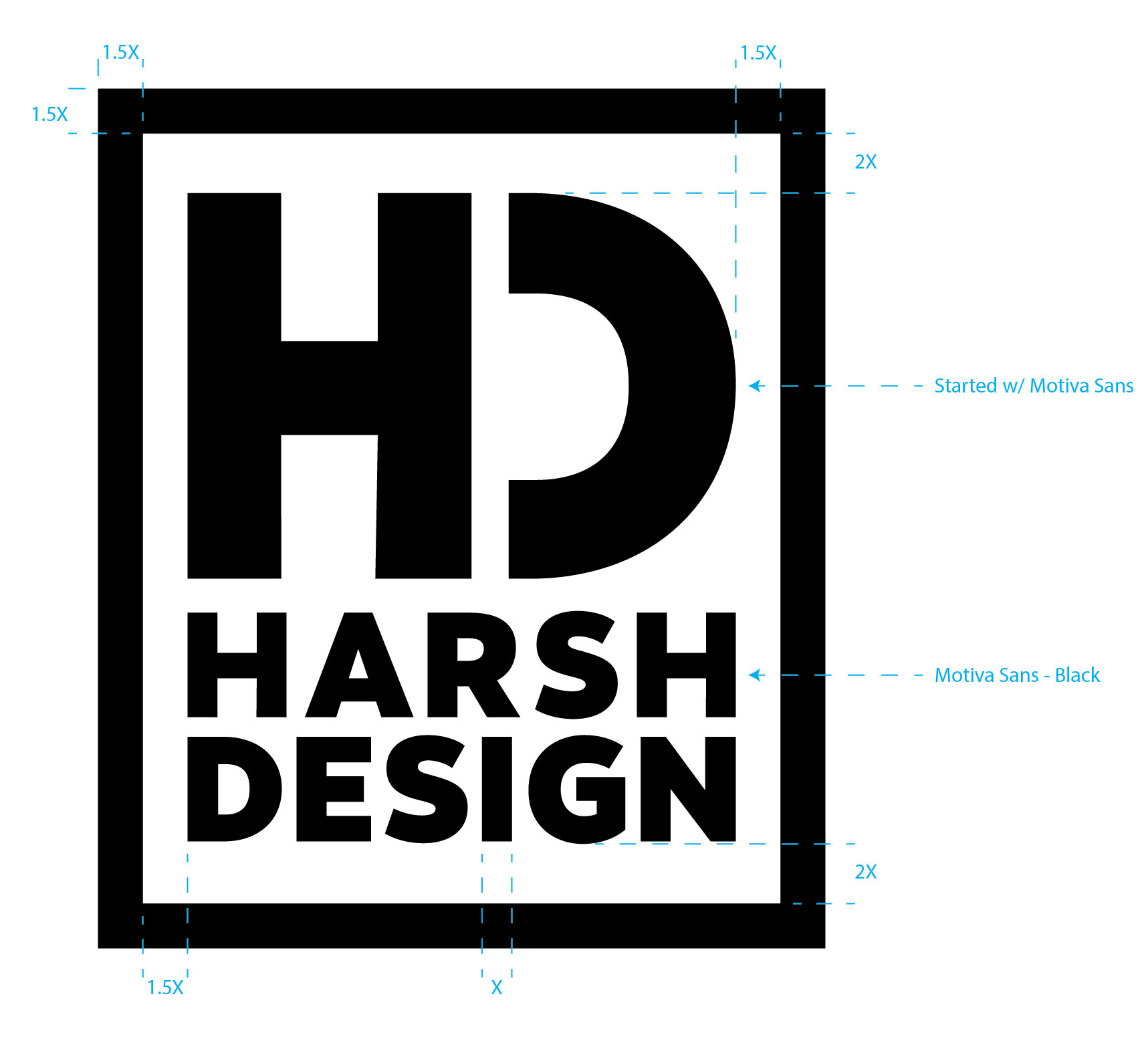
Harsh Design


The Concept

As a young budding designer moving into doing freelance work I needed a logo to attach my brand to. I wanted it to be clean, simple and easily recognizable.

IMG_20190505_111621.jpg

The Process

Interestingly enough, most of my ideas start as a rough sketch or bullet points on a sticky note or in my pocket notebook. This project was no exception as the photo (left) shows.

With the initial idea down on paper, I transferred to my project notebook to refine and note the progress as I worked the design digitally (seen below).

IMG_20190505_111858.jpg
IMG_20190505_111820.jpg

The Structure

My idea was down, lines on paper, and visually constructed. The next logical step was to give the logo structure.

To do this I ironed out the grid structure and made sure the lines & stroke were proportional. I documented this with the photo (right).

HD-HARSH DESIGN_FINAL-02.jpg

The Finished Product

In the end, I stayed with a single-color concept. I felt this would give me the ability to expand and adapt to different applications as needed. The below photos show the logo at both ends of the color spectrum, white & black.

HD-HARSH DESIGN_FINAL-01.jpg
HD-HARSH DESIGN_FINAL_W-01.jpg

Applying the Design

IMG_20190504_110354.jpg
 
IMG_20190504_110354.jpg